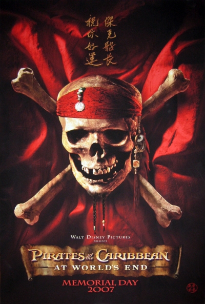
From Iwatchstuff, "Here is the poster for Pirates of the Caribbean: At World's End. Many of you may have seen this image before as the international warning symbol for Bohemian poison."
Happy Halloween everybody! Julie's working late and the boy doesn't have school tomorrow so he's heading to one of those crazy f...


7 comments:
The poster is, well, exactly what you'd expect, which is fine with me.
I tend to be inordinately impressed with the whole "Pirates" project, just because it should have been the most ridiculous forgettable disaster (like Disney's other "let's make our rides into movies" entry, The Haunted Mansion with Eddie Murphy) and it wasn't.
The reason it wasn't? 1) Disney partnered with Jerry Bruckheimer, which is one of those brilliantly wrong pair-ups (The man behind "Con Air," "Bad Boys" and "Armageddon" doing a Disney?) who then hired Verbinski, who has this slight advantage of being incredibly fucking good (The Mexican, The Ring).
Listen to all the DVD commentary on the Pirate movies and you can just tell how goddamned smart they all are; on "Dead Man's Chest" the writer talks about how they insisted on "reverse-engineering an over-arching trilogy structure" rather than making "an episode, like a Bond movie" and this new poster and title show that we're supposed to "feel" the conclusion of that trilogy coming.
I haven't watched all of Pirates 2 so I don't know who gets killed/beaten up/lost/found/kissed/drowned/crowned etc. so don't give that shit away.
I've been really enjoying the Pirates films thus far, although I think both could use some serious trimming. I can't wait for the third one. I need to find out what happnes after Jack...
Just kidding Jordan!
Just to belabor the point: the Pirates writer talks about carefully introducing the dog with the keys, the mayor being dunked etc. into the movies to create the impression that THIS story (the "Black Pearl" story, and now the movie trilogy story) is/was the basis for the ride.
The writer makes a funny snide remark about something in the movie and then adds "since apparently there's some question about using a literary device in a summer movie."
These are smart, smart people who knew exactly what to do when they got the gig.
(And one of the things they knew to do, by the way, was put Keira Knightley in "guy clothes.")
In fact, the more I think about it, the more I realize that having EXACTLY THE SAME POSTER (but with a color switch, like going from the Marlboro box to the Marlboro Menthol box) is teh genius.
I mean, you're at the multiplex, you see that, you give them your money again. No questions asked; no elaboration necessary. They're like, "You know what this is, right? Pay up." It's their Coke logo, and the third film is still the real stuff (not some spin-off or animation or comic or novelization or whatever, but the kind with Johnny Depp in it).
So I like the poster. The "Spider-Man 3" thing is completely different because they're NOT telling a three-part story but a series of comix, so the enormous numerals are perfect, emphasizing the sequenitality. "LOOK WHAT HAPPENS THIS TIME!" Stan Lee is always screaming. So the posters with the Venom textures and the huge chrome "3" is great. (Whereas Pirates, like Lord of the Rings and The Matrix (but unlike Star Wars) HAS NO numerals.
(I think about this stuff too much; admitedly.)
Dead Man's Chest was the debut of the brand new, post-Pixar Walt Disney Pictures animated logo. It's stunning. (I've been trying to track down info on the dude who did it; if he's a Pixar guy or not. It's like a bookend to Pixar's version of the Walt Disney Animation logo that debuted on Toy Story. Just more excellence all around.
I like this poster more than the last one, with the faces of the three main players looking all serious. That skull, in contrast, looks nice and relaxed.
I enjoyed Dead Man's Chest but it suffered from that thing that afflicted other chapter twos of trilogies, in that it really seems like a chapter two and not its own flick. This also happened with Back to the Future Part II and Matrix Reloaded (both movies I really like, mind you). Notable chapter twos that avoid this are Empire and Two Towers.
It's choosing how to end things, really. I heard some bitching about Dead Man's Chest, and I think the people who didn't like it were just annoyed by the lead-in and loose ends at the movie's finish, which drew attention from all the good stuff that happened.
octo,
Just like with Ghostbusters, each Pirates movie has two basic poster schemes: the skull, and then the three of them (or each of them in three posters for the tease for the 2nd movie). The first movie actually may not have had actor fotos: but it definitely had the skull. They want the skull to be the thing where you get all three posters and they match like the spines of leatherbound books. (And you can easily get them in the wrong order since there are no numbers and some smartass comes over and lectures you about how "green's the middle one! It goes black, green, then red."
Etc.
Post a Comment